Pulse
Streamlining the patient profile management experience for doctors in a Healthcare SaaS
Team
1 Product Manager
1 Customer Success Manager
3 Engineers
1 UX Designer (Me)
What is Pulse?
Pulse is a B2B healthcare workspace for doctors and coordinators. It helps them take care of patients by organizing their profiles and treatments.
🎯 Problem Statement
How might we help healthcare professionals efficiently manage patient profiles?
My Responsibility
📑 Identify user pain points
Conduct 5 sessions of user interviews to understand their experiences
Conduct competitors analysis to learn gaps and opportunities
✏️ Develop information architecture and prototype
Define specific and measurable design goals
Organize the Information Architecture to ensure informaiton hierarchy
Generate and evaluate possible design solutions for addressing users' pain points
Prototype high-fidelity designs
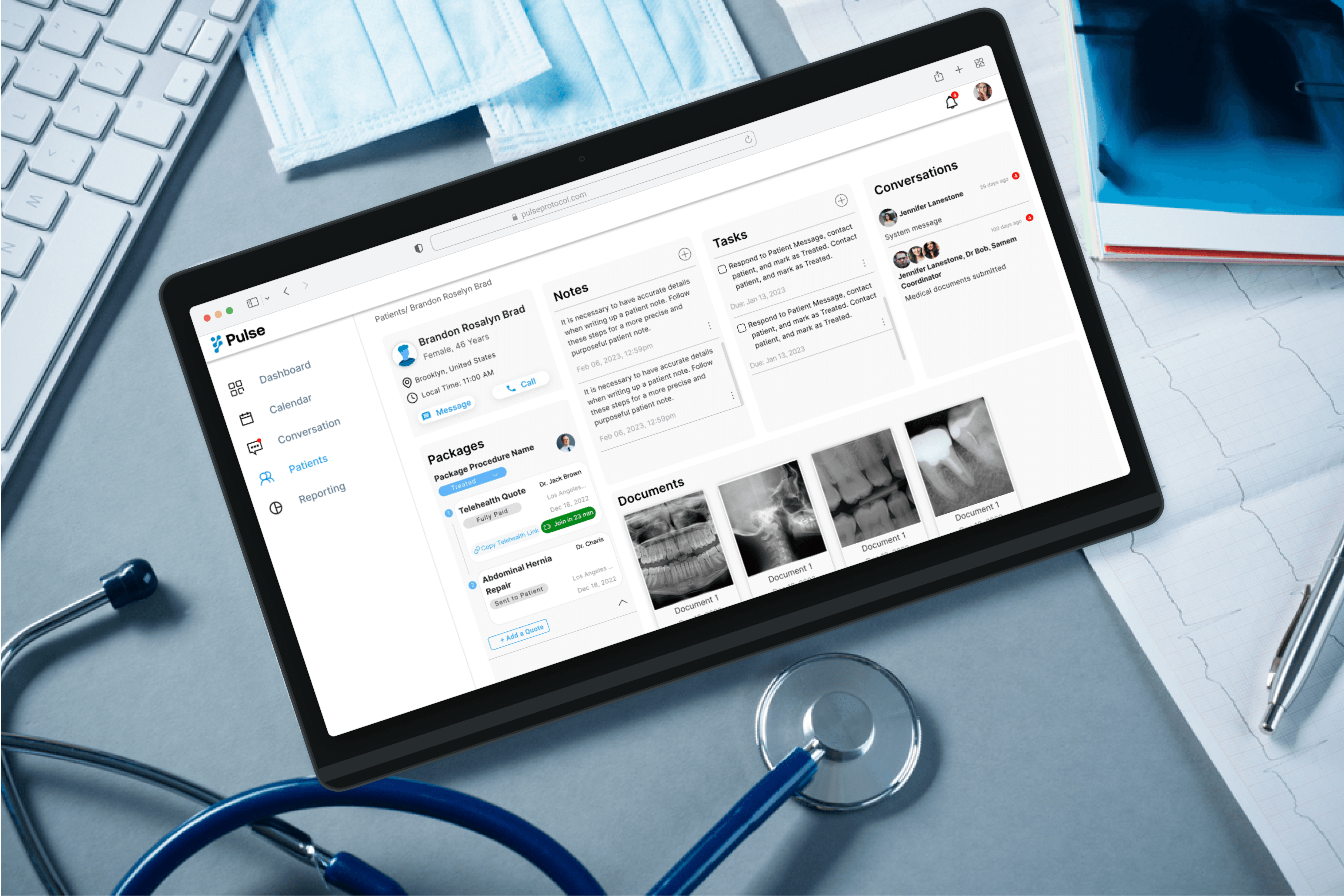
Final Solution
Customizing Board View for Patient Information Management
I tailored the board view with the following intentions:
Designing for our healthcare professionals based on their preferred management metrics - focusing on patients' status.
Allowing them to easily switch and oversee the status of all their patients.

Viewing Quote Details in an On-Page Drawer
I structured the view for quote details with the following intentions:
Facilitating access to crucial information without navigating away from the main page.
Minimizing page clutter for a cleaner and more focused user experience.
Providing the drawer with flexibility for future quote editing capabilities.

Full screen drawer
It can expand to full screen when they need to edit the quote.

Impact
🎉 The new platform with patient management feature has been launched!

Kickoff: From Ambiguity to Precision
The story begins with a meeting involving a product manager, a customer success manager, and myself. In the meeting, the PM mentioned that the healthcare professionals are not using our platform to manage patient profiles. He wanted me to find the reason and come up with potential design solutions.
Main Assumption
The PMs initial hypothesis was that the low engagement rates were primarily attributed to a lack of user motivation within the tracking phase, highlighting a pivotal area for enhancement.
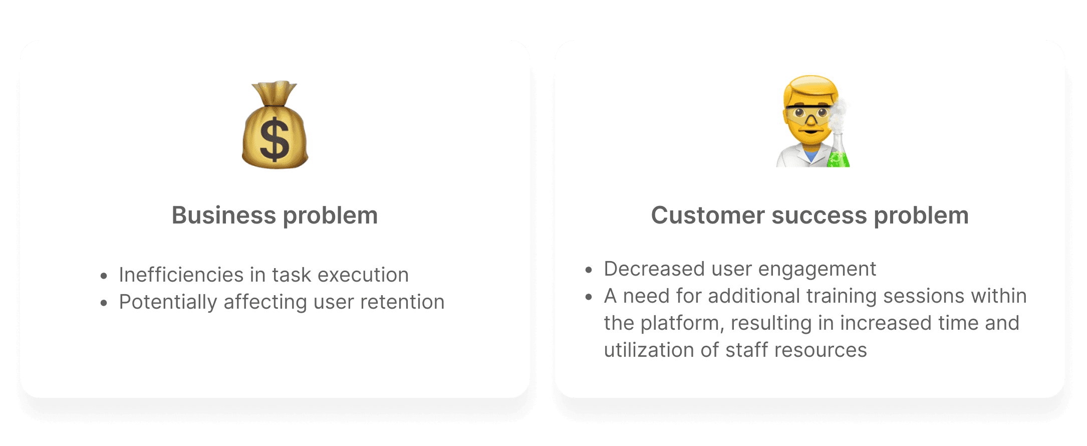
“Patient profile management is our key experience, but we've observed a decline in user engagement.” – Pulse product manager
Insights from research
To dig down to the root of these problems and potentially solve them, I conducted competitor analysis and 5 sessions of user interviews.
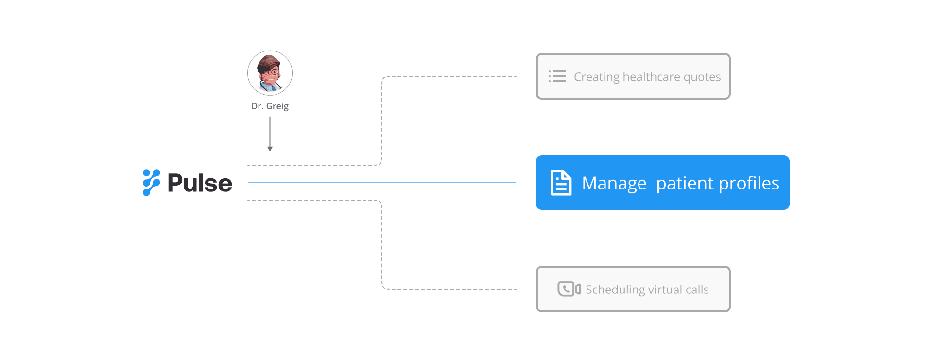
Pain points of Dr. Greig: Complex Information in the Platform

Design Goals: Design Specific and measurable
To dig down to the root of these problems and potentially solve them, I started researching with the following method.

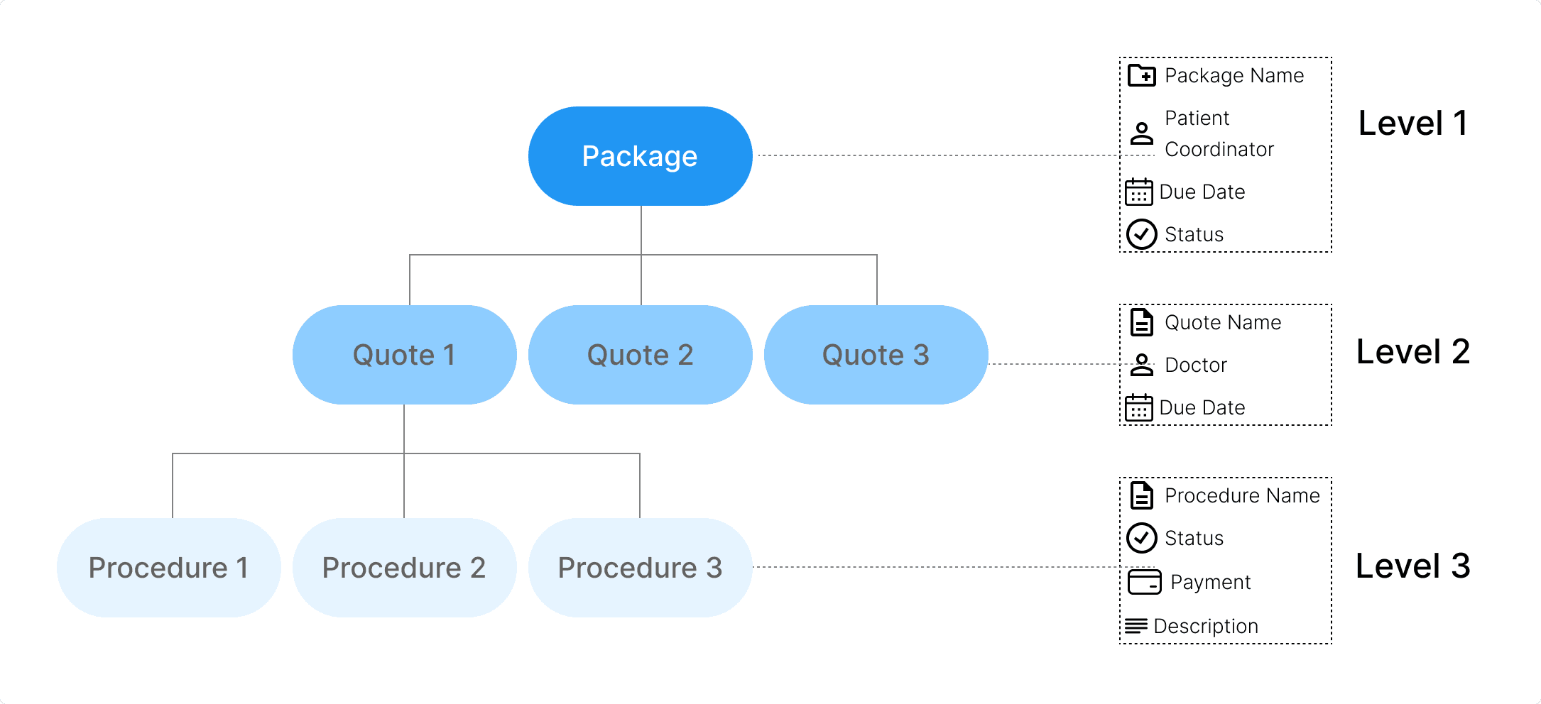
Optimizing information hierarchy
The objective for this is to create an interface that efficiently reveals Level 1 and Level 2 information, ultimately saving users' time. Details related to Level 3 will be disclosed at a later stage.
Patient Profile Management Interface Ideation
Inspired by our indirect competitors- the task management software, I designed three views to present Level 1 and Level 2 information
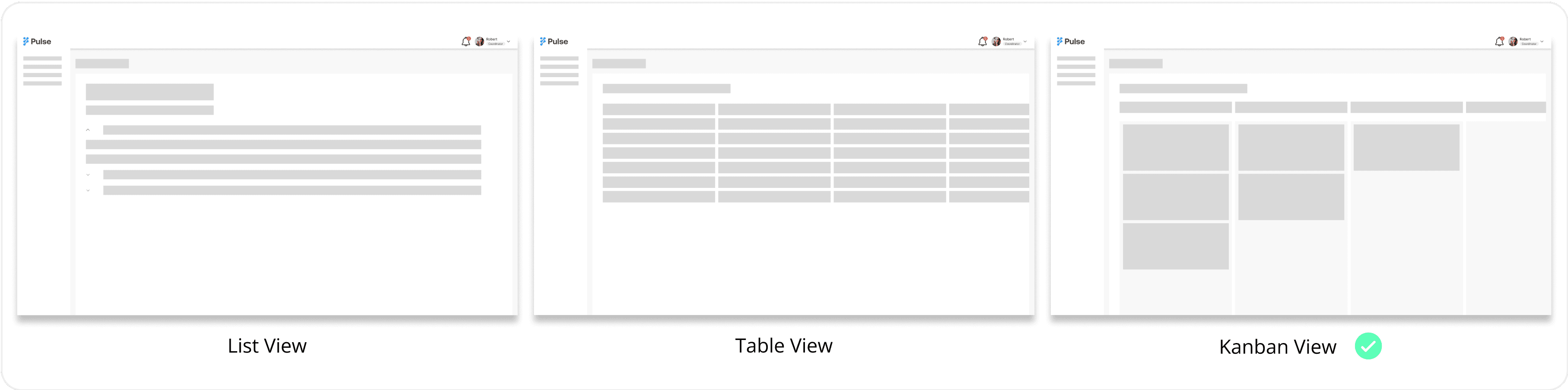
During the team design review, the consensus was that the board view stands out as the most favorable option for two key reasons:
1# Users’ needs: It effectively emphasizes the crucial element of "status," which holds paramount importance in profile management.
2# Budget constraints: While acknowledging the potential benefits of all views, budget constraints limit our ability to implement all three, making the board view the preferred choice.
Collaborated with developers through iterations
However, during the meeting with the developers, they raised a concern about edge cases: board views with numerous cards and visual elements could potentially demand more system resources.
So I designed the progressive loading to resolve this:
Initially displays level 1 information by default. Users have the option to choose whether to expand to level 2 at their discretion.

Streamlining the user flow
The next step involves enhancing the flow for a more streamlined display of quote details. I have conceptualized three solutions:
Solution #1 Incorporate Quotes Within the Page Using Accordions
The initial approach employs accordions, allowing for the expansion of details within the same page. This enables doctors to access the information they need without navigating away.

Solution #2 Quote Details in an On-Page Drawer
Another solution is to implement a drawer mechanism, segregating the quote details to reduce visual clutter. This approach aims to minimize cognitive load, making it easier for doctors to process the information.

Solution #3 Pop-up Window
The third option is to open a pop-up window within the page, creating a distinct visual hierarchy and ensuring that the quote details are prominently displayed.

Design Decision
The drawer solution was chosen during the design review because it's the simplest way to add details without disrupting the user flow.
How is Dr. Greig doing?

Feedback from my teammates
It's also a wonderful experience for me to align my design with crossfunction teams. I got the following positive feedback from my teams.

charisliang121@gmail.com · Linkedin · Resume
Website content and deisgn © Charis Liang