Fini
Design end-to-end fitness experience focusing on joining, tracking and creating challenges that enhance user engagement and subscriptions.

Team
1 Product Manager
1 Engineer
1 Designer (Me)
What is Fini?
Fini is a fitness playground to help fitness enthusiasts to manage their fitness challenges.

Other things about Fini:
Available on both iOS and Android devices
Monetization
In-app purchases: Users can unlock additional features and content to enhance their fitness journey.
Brand partnerships: We collaborate with fitness brands, offering targeted promotions and in-app experiences (revenue generated through agency fees). However, the app has encountered challenges with low user retention.
Problem Statement:
How can we help fitness enthusiasts sticking with their workout plan more FUN?
My Responsibility
📑 Led Design Goal Prioritization
Organized insights from app analytics, usability tests, and heuristic evaluation.
Facilitated a prioritization workshop with cross-functional teams.
📝Translated Design Goals into Action
Developed actionable plans using a Job-to-be-done framework and design tactics.
✏️ Designed MVP Features
Presented at least 2 versions of options for design review
Iterated quickly based on insights from team and users
Impact
The main aim of redesigning was to boost user interest, which directly affects how we make money from the app. When users engage more, they're more likely to buy stuff in the app and partner with brands. As the lead designer for the fitness app, I saw a big jump in user activity after tweaking the core features. Our daily users went up, people spent more time on the app, and subscriptions increased.


Beginning of the story
PM came to me with a request:
The app has encountered challenges with low user retention, complicating efforts to
Recurring Subscription
Reduced Acquisition Costs
Main Assumption
The PMs initial hypothesis was that the low engagement rates were primarily attributed to a lack of user motivation within the tracking phase, highlighting a pivotal area for enhancement.

However...
Despite our initial assumptions, it became evident that our hypothesis regarding user engagement and tracking experience was off the mark.
How I revisited our assumption
Key insight from analytics
Our analysis of Adobe Analytics data revealed a significant 80% drop-off rate during the Join phase.

Deeper insights from usability testing
Users struggled to discover relevant challenges due to limited filtering options and an information-overloaded discovery page with a weak hierarchy.

Deeper insights from heuristic evaluation
Delving deeper into the issue, a heuristic evaluation highlighted a disorganized information hierarchy.
Learnt from Atlassian content strategist, I audit the content from the following perspectives to better understand the content and usability.
I found the cluttered structure proved to be a stumbling block for user navigation and engagement and retention.

Other insights from heuristic evaluation & usability tests
Additional insights from heuristic evaluation and usability testing revealed:

Prioritization
To tackle this challenge, I facilitated a prioritization workshop, where team members openly discussed and debated the significance of each issue.

MVP Prioritization...
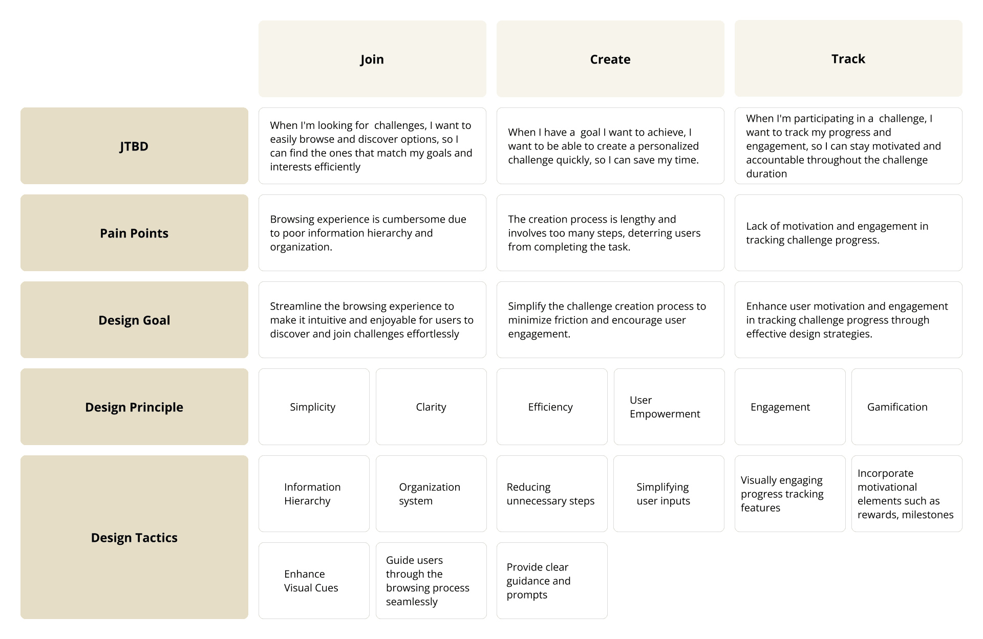
MVP Focus on Join the challenge, create the challenge, and track the challenge experience for enhanced impact and growth
How I translate insights into actionable next steps
How I developed the solution
Join the challenge
Browsing experience is cumbersome due to poor information hierarchy and organization
Design challenge
HMW create a browsing experience that is intuitive and engaging, so they can easily discover and join challenges that align with their goals and interests?
Organization System: GPS & Self-report Tracking
Content Audit
I conducted a content audit as part of the heuristic evaluation, focusing on whether the information architecture facilitates users in quickly discovering content. This audit involved evaluating the following aspects:
Category Alignment with User Habits: Do the current categorization methods align with how users would naturally expect to find information?
Category Redundancy: Are there any overlapping categories that could lead to confusion for users?
Category Clarity: Are the category names clear, concise, and easy to understand for the target audience?

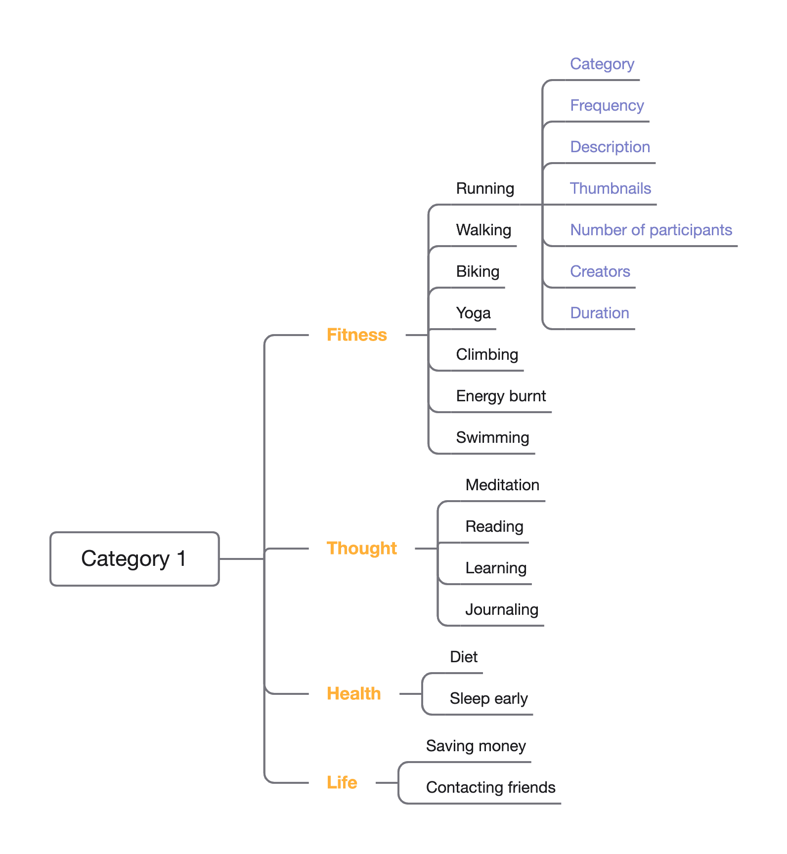
Re-categorization
Category 1. By Project Type
Level 1: Large categories such as Exercise, Wellness, Growth, and Socializing. The categorization criteria are that the names are simple, there is no overlap between the categories, and it is easy to add new items later on.
Level 2: Specific projects like walking, running, biking, climbing, yoga, and energy burnt. This categorization allows for faster navigation to the homepage.
Category 2. By Trackability with GPS
Most popular activities (based on backend data) such as running and walking can be tracked with GPS. Therefore, automatically recorded data can significantly improve the user experience.
Other activities that require self-reporting, such as meditation and saving money, can be used for milestone tracking, which can also make users feel more accomplished throughout the process.

Discover Page Layout
To optimize the homepage for user browsing, I explored three layout variations. All versions share these core elements to ensure a seamless experience:
Clear Navigation: Easy-to-find category navigation options will guide users efficiently.
Search Functionality: A robust search function empowers users to quickly locate specific challenges.
Here's a breakdown of the unique features in each design:

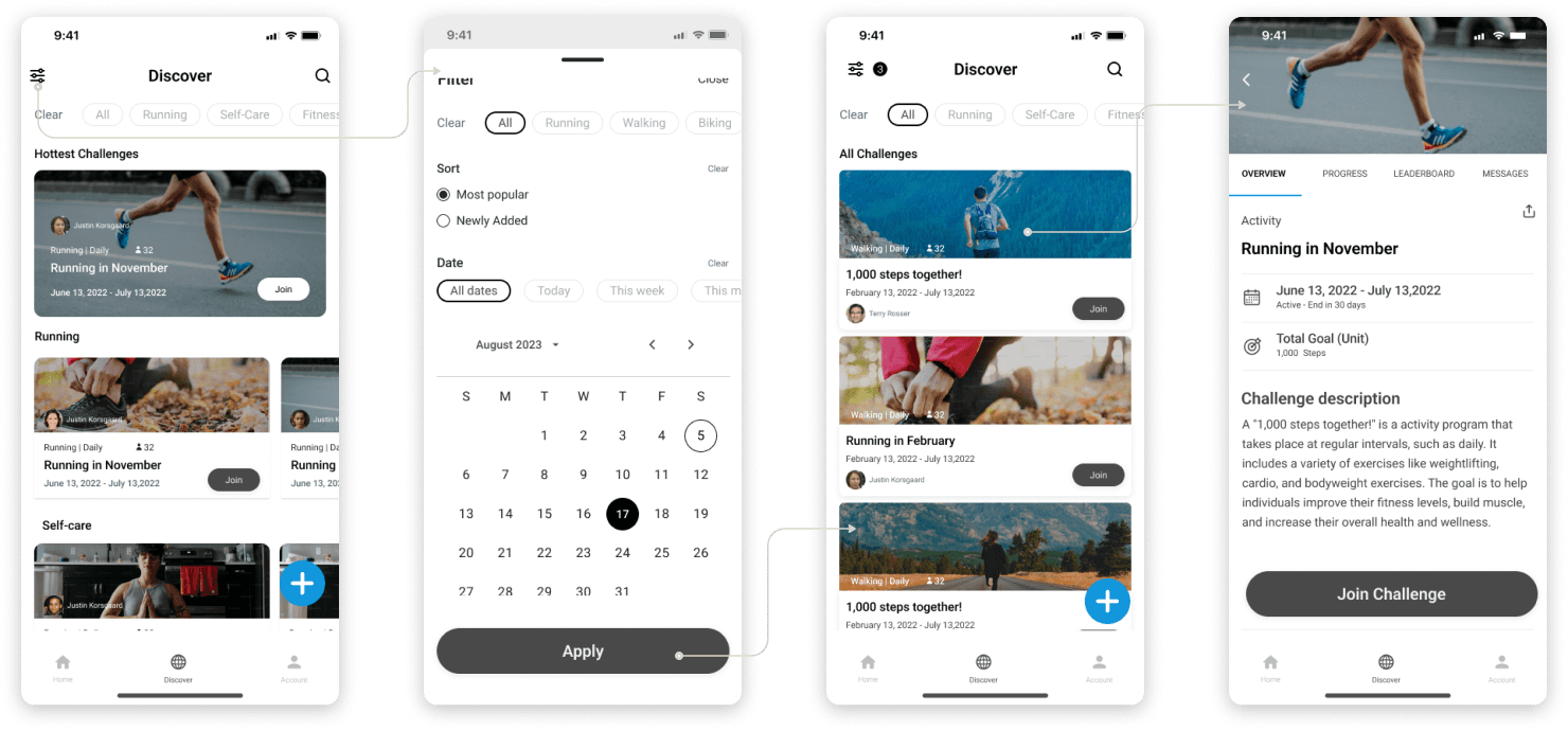
Easier Filter
To cater to different user needs, I designed two filter options:
Version 1: Two-layer filter. This option provides a two-tiered approach to filtering content. The first layer focuses on frequently used filters, like challenge categories. This allows users to quickly find relevant entries. The second layer offers advanced search functionality for additional attributes such as duration and popularity, enabling users to refine their search based on specific criteria.
Version 2: Single-layer filter. This option prioritizes ease of access. By placing a simplified filter directly on the homepage, users can readily initiate their exploration without navigating to dedicated search pages.

Discover Page Final Design
Before↓
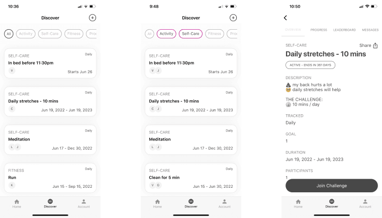
After↓
Track the challenge
Lack of motivation and engagement in tracking challenge progress.
Design challenge
HMW design a tracking system that effectively motivates and engages users to monitor their progress, so they can stay committed and accountable throughout the challenge duration?
Direction Exploration
I gathered initial feedback on the concepts by having 5 colleagues assess their potential to enhance user tracking.
Direction 1: Milestone celebration
✅ Positive reinforcement: Celebrating progress can help users stay consistent and avoid giving up when faced with challenges.
❌ Risk of feeling overwhelming: Too many celebrations or irrelevant rewards can clutter the interface and feel overwhelming for users.
Direction 2: Experience Points (XP) and Leveling Up
✅ Enhanced Engagement: Community-driven rewards and personalized progression create a more compelling and rewarding experience.
❌ Development Effort: Designing a comprehensive and engaging XP system requires careful planning and integration with external partners.
Direction 3: Social Leaderboards
✅ Community Building: Shared goals and achievements on leaderboards can foster a sense of belonging and connection.
❌ Limited engagement with smaller user base: When the user base is small, the leaderboard may lack diversity and excitement.

Concepts wireframe
Design Review with Co-workers

Concepts voting analysis
After review, we decided to reject XP and Leveling up as it would cost more effort to develop.
Concept Exploration
Concept 1: Milestone Celebration
To explore the design for milestone celebrations, I developed two directions that cater to different user preferences:
Calendar Focus: This version prioritizes a comprehensive calendar view, allowing users to visualize all their milestones and effectively plan and schedule related activities.
Celebration Focus: This direction emphasizes the act of celebrating milestones. It introduces an activities log where users can record their achievements, fostering a sense of accomplishment and reducing pressure associated with empty calendar spaces.
Option 1: Calendar Combo

Calendar + Progress bar VS Calendar + Milestone
Option 2: Milestone Celebration

Milestone + Activity log VS Milestone + Progress bar
Concept 2: Social Leaderboard
I created two leaderboards with features to boost motivation (e.g., first place cover showcase) and foster community (e.g., user interactions).

Leaderboard with “like” interaction VS Leaderboard with more interactions
Gorilla testing
I collaborated with another designer to showcase the 3 version of mockups to a small group of users (7):
each person around 20min sessions
finished within 2 days
remotely testing
Insights
5/7 users expressed feeling stressed when encountering empty space in the calendar.
7/7 users favor a simple like on the leaderboard, with a desire to see achieving first place as the primary reward.
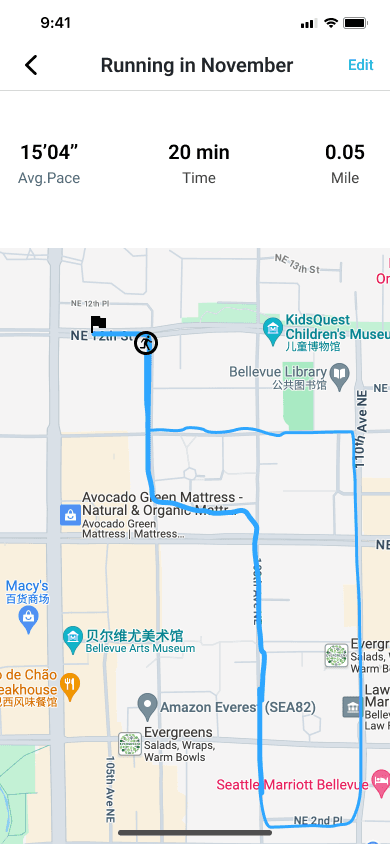
Tracking Final Design
Before↓
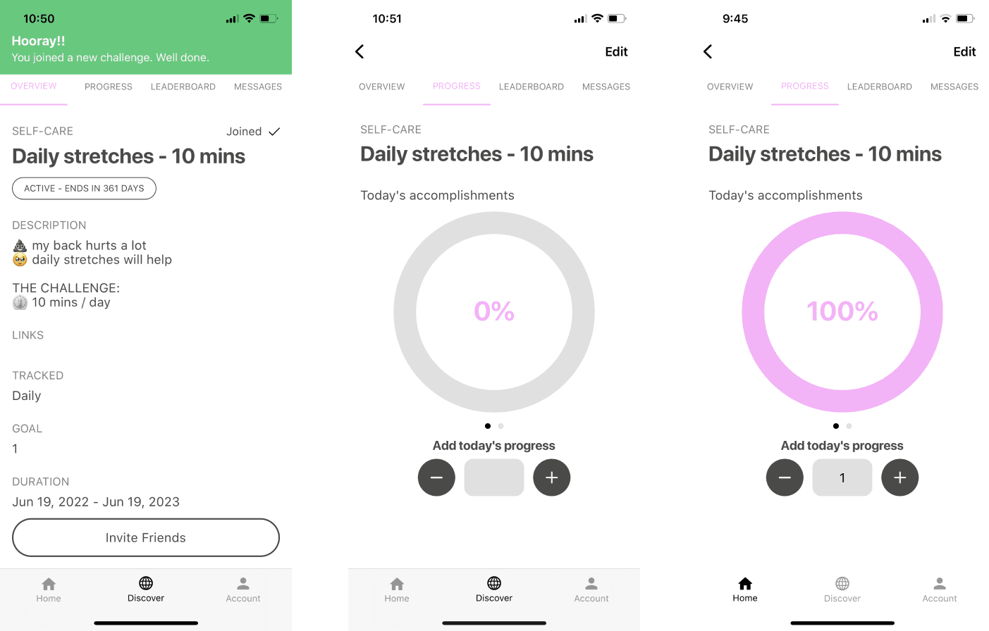
After↓
GPS Tracking

Self-report Tracking

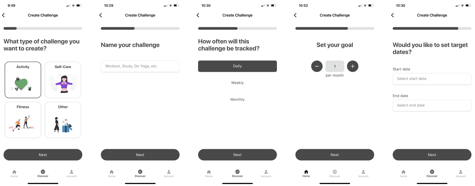
Create the challenge
The creation process is lengthy and involves too many steps, deterring users from completing the task
Design challenge
HMW streamline the challenge creation process to be efficient and user-friendly?
Insights from previous tests
From usability test:
the process is too long, and the separated screen is easy for users to loose track of the context.
So I combined all the process in 2 screens.
Creating Final Design
Before↓
After↓

Final solutions
Joining the challenge
Effortless Filtering: Discover challenges that fit your interests with intuitive filters.
Quick Navigation: Dive right into challenges that inspire you with a clear visual hierarchy.


Two ways to track the challenge (1)
Quick Input: Easily record progress for self-reported challenges.
Two ways to track the challenge (2)
Quick Input: Easily record progress for self-reported challenges.


Creating the challenge
Effortless Setup: Create challenges with a quick and intuitive process.
User feedback after launch

Reflection
This project, particularly working within a remote fitness startup environment, highlighted the critical role of clear design communication. While design skills are important, getting stakeholder buy-in requires effectively translating your vision into actionable insights.
Here's what I learned to bridge the communication gap in a remote setting:
Workshops: Facilitating workshops fostered alignment across teams, ensuring everyone understood the overall vision and prioritized goals.
Shared User Research & Competitor Analysis: Presenting data on industry trends and user research provided a data-driven foundation for design decisions.
Iterative Wireframes & Mockups: I used clear rationales to explain design choices, often presenting multiple options to inspire discussions and inform stakeholder decisions.
These communication strategies helped ensure my design solutions were well-received and ultimately successful for the project.
← Project name 1
charisliang121@gmail.com · Linkedin · Resume
Website content and deisgn © Charis Liang