Pulse
Streamlining the patient profile management experience for doctors in a Healthcare SaaS

Project type
Contract
Timeline
3 Month
Team
Product Manager Josh Lavinsky
Customer Success Manager Yulia Shibanova
Product Designer (Me)
3 Developers
Project Status
🚀 Launched
What is Pulse?
A healthcare SaaS for doctors
Pulse Protocol, established in 2015, is a SaaS healthcare company.
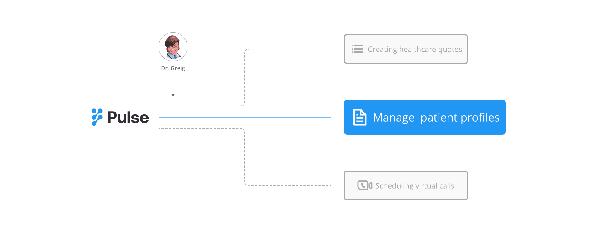
Its flagship product, Pulse, serves as a healthcare workspace designed for doctors and coordinators to effectively manage and grow their medical business. Pulse offers service like managing patient treatment status and profiles, scheduling virtual calls, etc.
Problem statement
Doctors are overwhelmed by patient information
Hospital doctors and coordinators face challenges in efficiently tracking patient treatment statuses and profiles.

However, Pulse currently lacks a tool for doctors to manage patient information, leading them to rely on external solutions. This poses a risk of decreased user engagement and retention.
Solutions
A kanban board for doctors, focusing on status
Status-Based Organization: Patients are organized by their status.
Easy-to-Archive: Easily archive files for completed statuses.

Drawers for detailed information
Easy Access Drawer: Browse detailed information directly within the page.
Full-Screen Drawer: Ideal for editing and performing more complex actions.

Mobile responsive
Customized Kanban for mobile with easy-to-navigate cards and details.


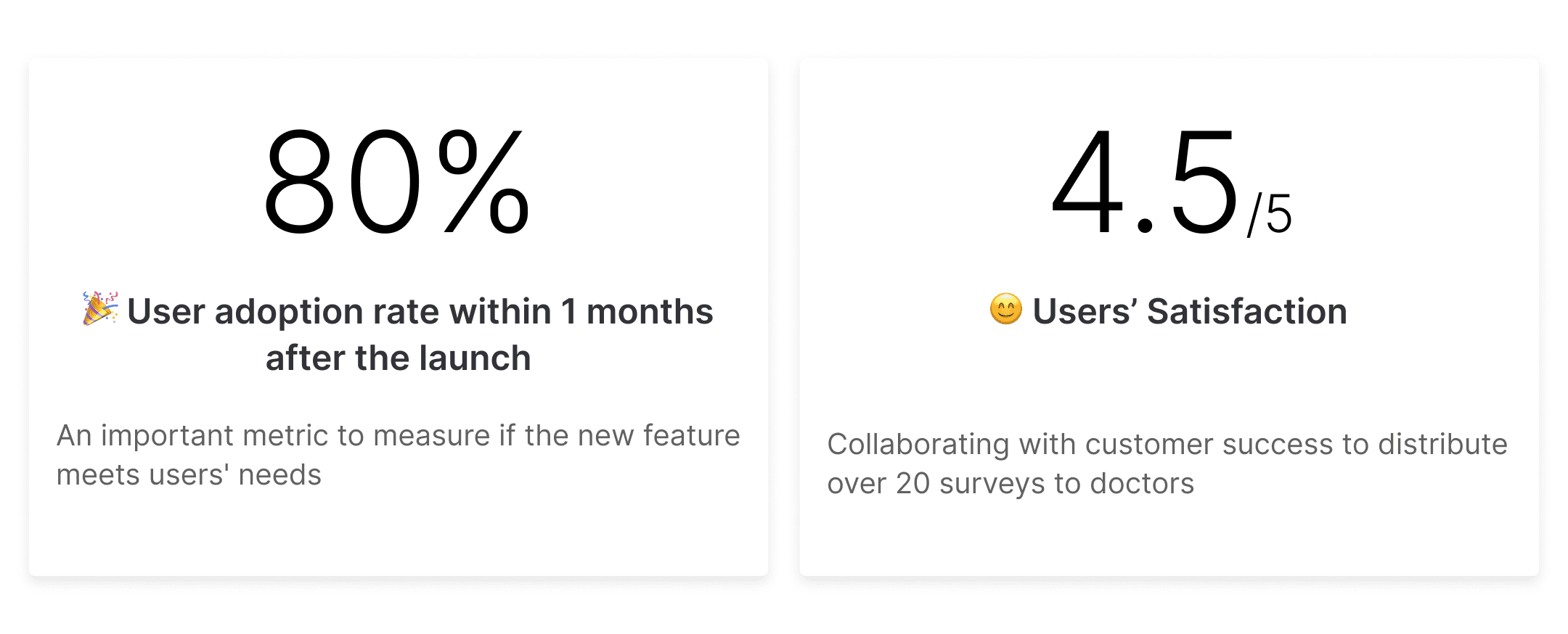
Impact
🎉 The new platform with patient management feature has been launched!
Process
Let's meet Greg
To dig down to the root of these problems and potentially solve them, I conducted 5 sessions of user interviews to build this persona.
Pain points of Greg: Complex Information in the Platform

Structuring information hierarchy
I led a card sorting exercise with the team, classifying the information into three tiers:
Level 1: Essential
Level 2: Supplementary
Level 3: Infrequently used, suitable for inclusion in the system

Based on the card sorting results, I created a new information architecture for the patient profile to display the parent-child relationships.

3 views to manage patient status
Inspired by task management software, I designed three views to present Level 1 information.
Option 1: List View
Clearly displays the relationship between packages and procedures.
Collapsible sections allow for more information to be shown, facilitating a comprehensive overview.
Option 2: Table View
Resembles a comprehensive spreadsheet, facilitating easy information filtering based on individual needs.

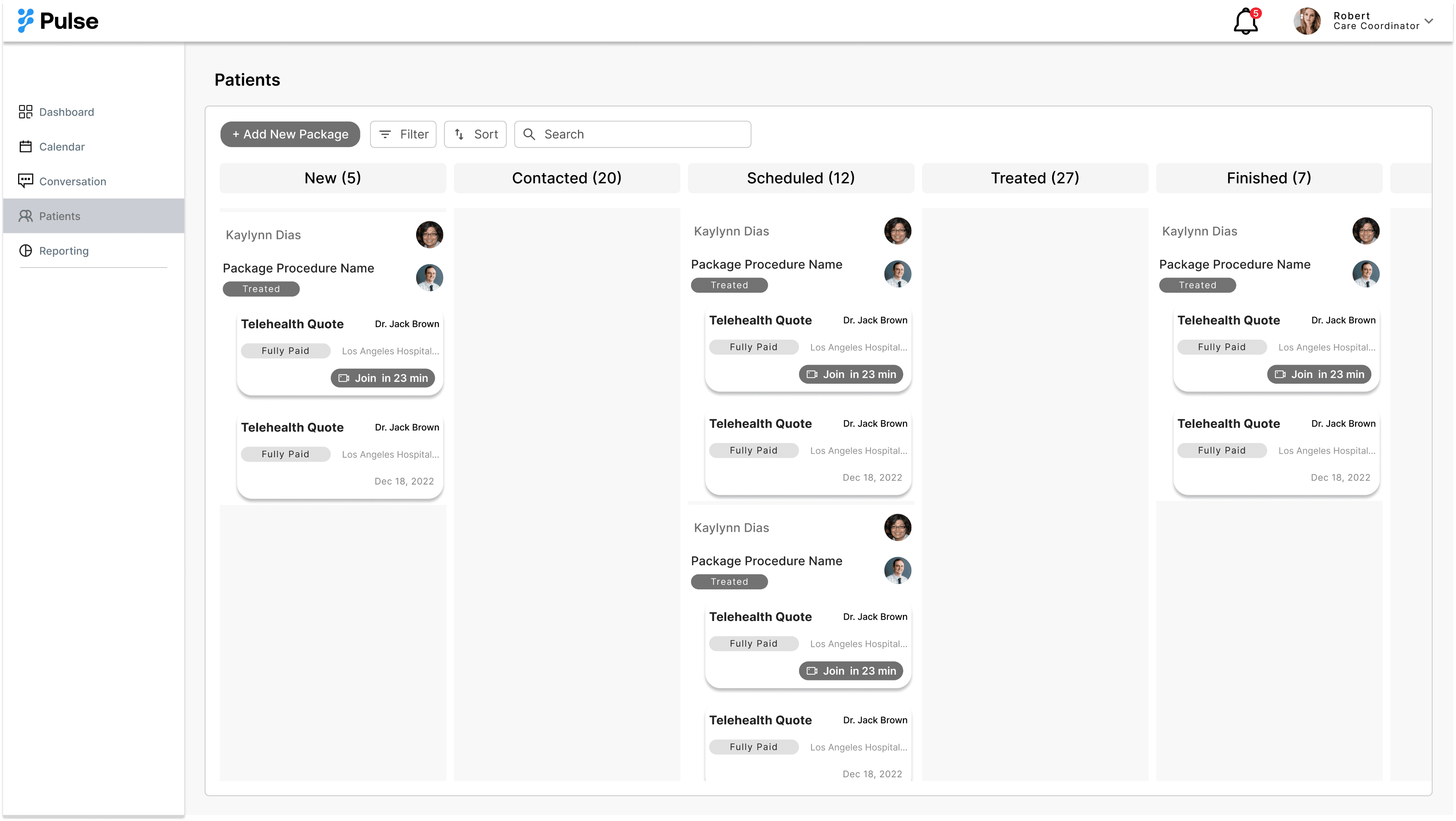
Option 3: Kanban View
During a meeting with the customer success manager, I learned that the most critical Level 1 information is the status. This view provides a clear overview of each status, making it easier to manage patients' treatment progress.
During discussions with the PM, I learned that due to budget constraints, we can currently only develop one view. Therefore, I chose the Kanban view as the interface for managing patient information because:
It meets users' needs; status is identified as the most critical information, desired for a comprehensive view (based on feedback from the customer success manager's survey).
Backend data indicates that the click-through tates for status information are higher than for other types of information within patient profiles.
Enhancing the Kanban view functionality
Pushback to optimize Kanban limitations
However, the PM highlighted some constraints with developing a Kanban board:
When statuses stack up, the Kanban board loading speed slows down.
Less information is visible on a single screen compared to other views.
In response, I proposed solutions to address these issues.
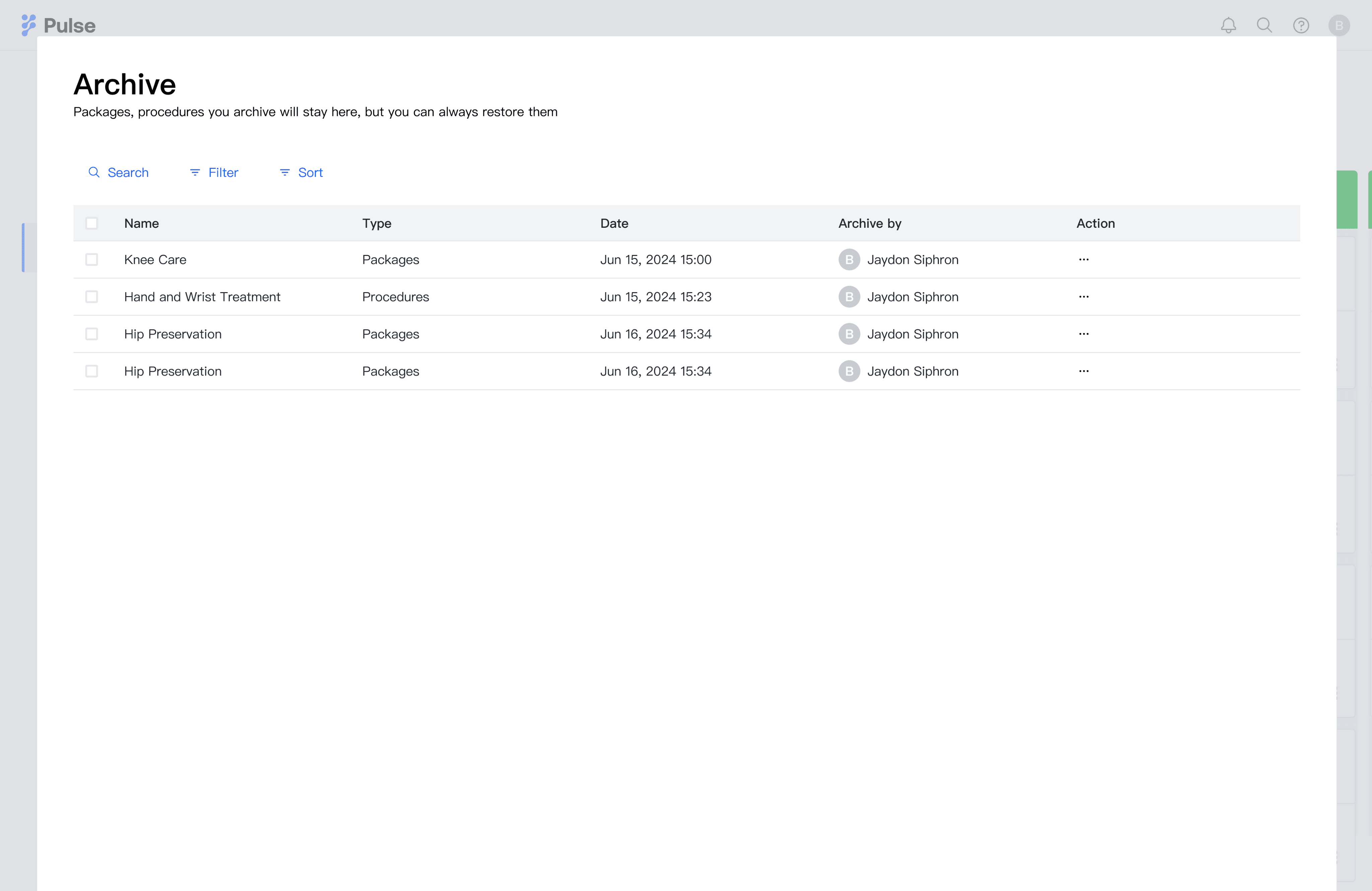
Solution 1: encourage users to archive package
To address the issue of Kanban potentially slowing down, I designed an easy-to-access archive button. When users complete or quit a package, they can quickly move it from the Kanban to the archive. The archive also includes a filter feature, making it easy to search for and restore packages.
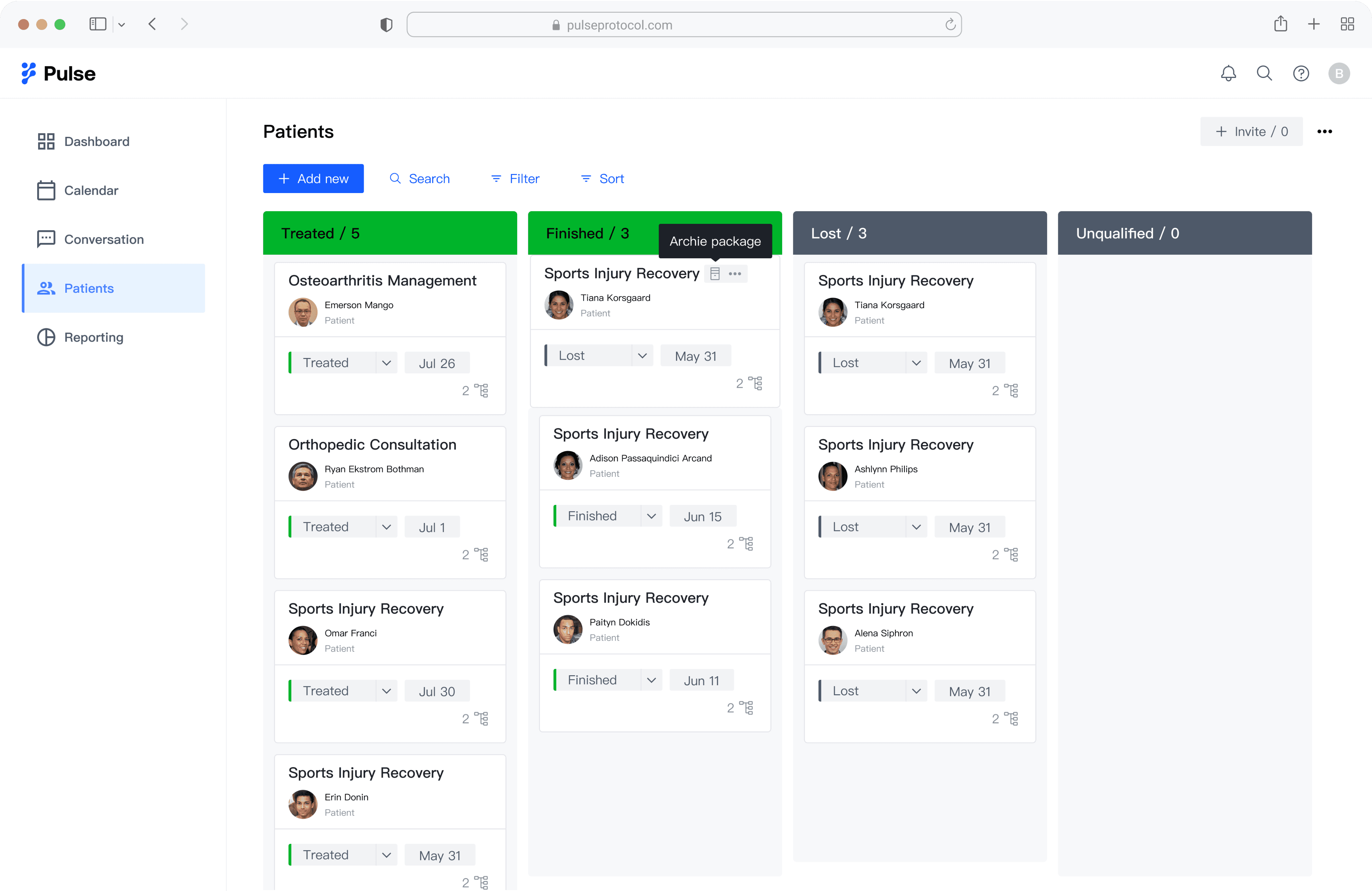
When hovering over the package, display the archive icon along with a tooltip.
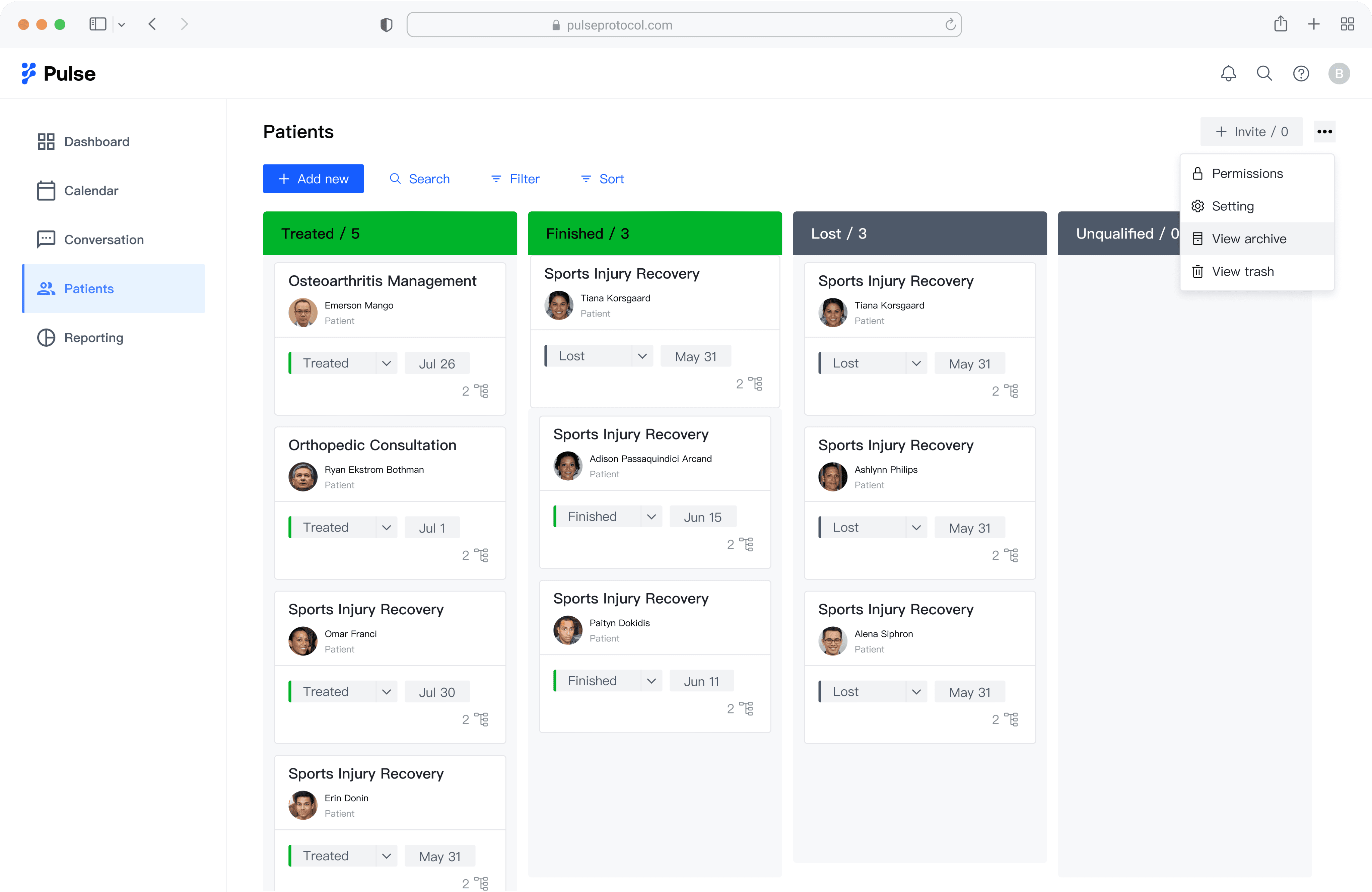
I designed an archive feature for users to view or restore items.
Solution 2: organizing card structure
To address the issue of reduced visible information on a single screen, I explored the card layout:
a. card hierarchy:
I refined the card design to emphasize the information hierarchy, clearly presenting the most critical information and relationships.
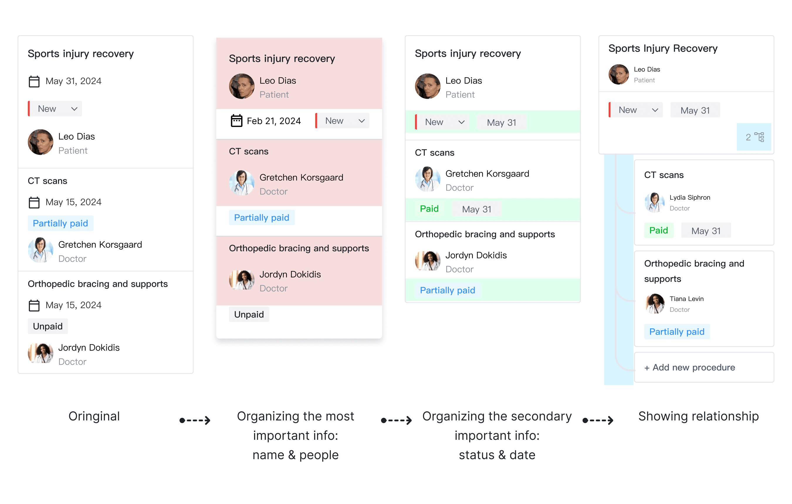
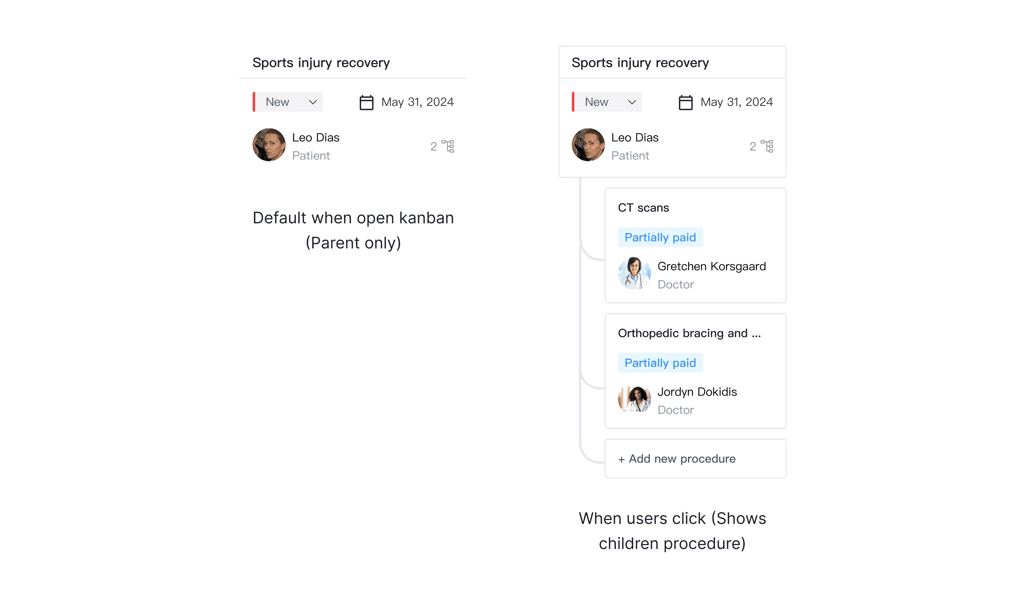
b. Parent-children relationship
The initial view displays only the most important packages, with the option to expand and view subitems, such as procedures.
Solution 3: color-code package status
I explored color coding options to balance a clean interface with an effective way to highlight statuses.
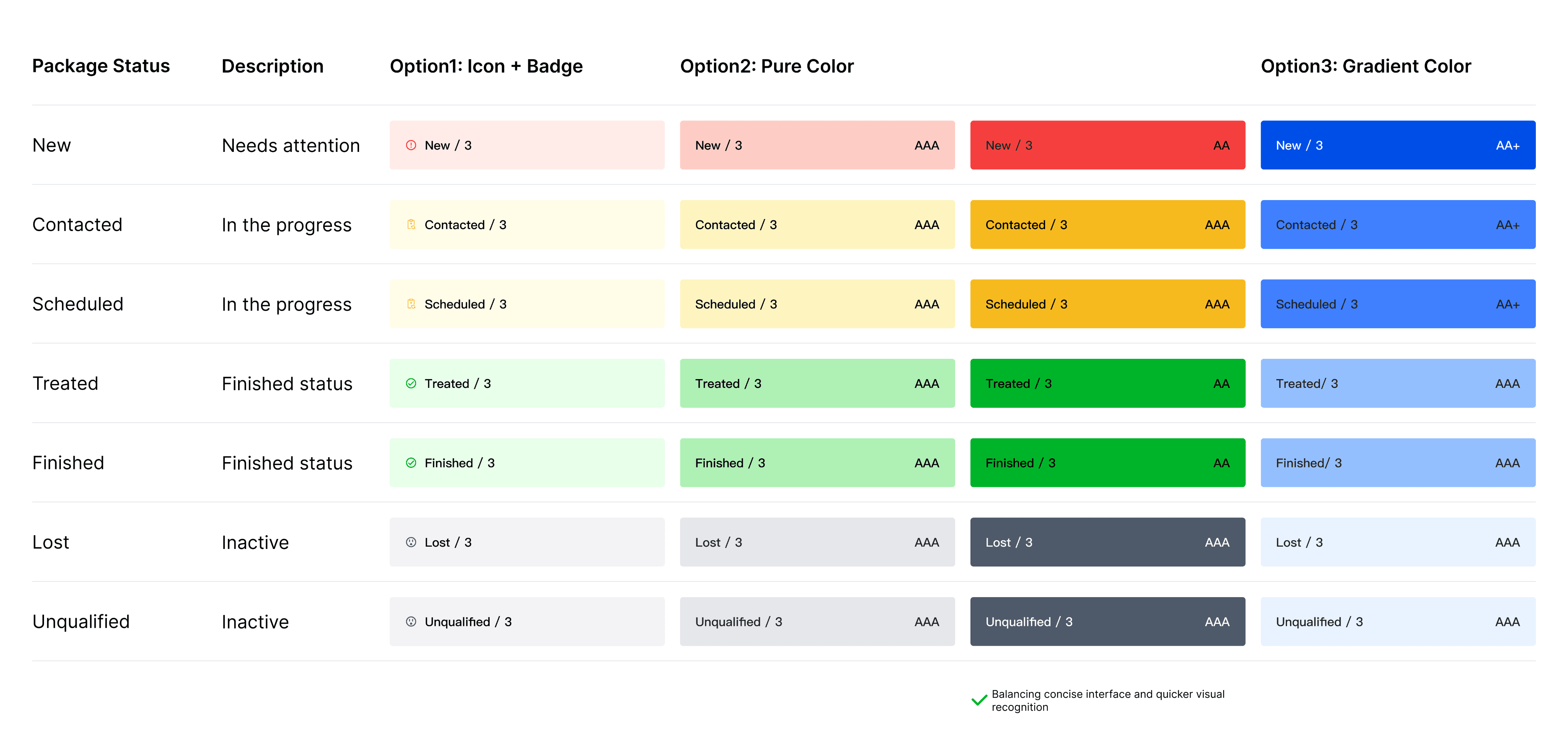
The PM and customer success manager provided positive feedback on these changes, allowing me to move forward to the next step: illustrating the user flow to showcase detailed information.
Streamlining the user flow: showing details
The next step involves enhancing the flow for a more streamlined display of procedure details like price details, balance due ect. I have conceptualized three solutions:
Option 1: Incorporate quotes within the page using accordions
The initial approach employs accordions, allowing for the expansion of details within the same page. This enables doctors to access the information they need without navigating away.
Option 2: Pop-up window
The third option is to open a pop-up window within the page, creating a distinct visual hierarchy and ensuring that the quote details are prominently displayed.
Option 3: Drawer
Another solution is to implement a drawer mechanism, segregating the quote details to reduce visual clutter. This approach aims to minimize cognitive load, making it easier for doctors to process the information.
Design Decision
The drawer solution was chosen because:
It allows for easy resizing and editing, accommodating more complex operations.
When using a drawer, users can stay on the same page, making it convenient to browse information.


How is Greg doing?
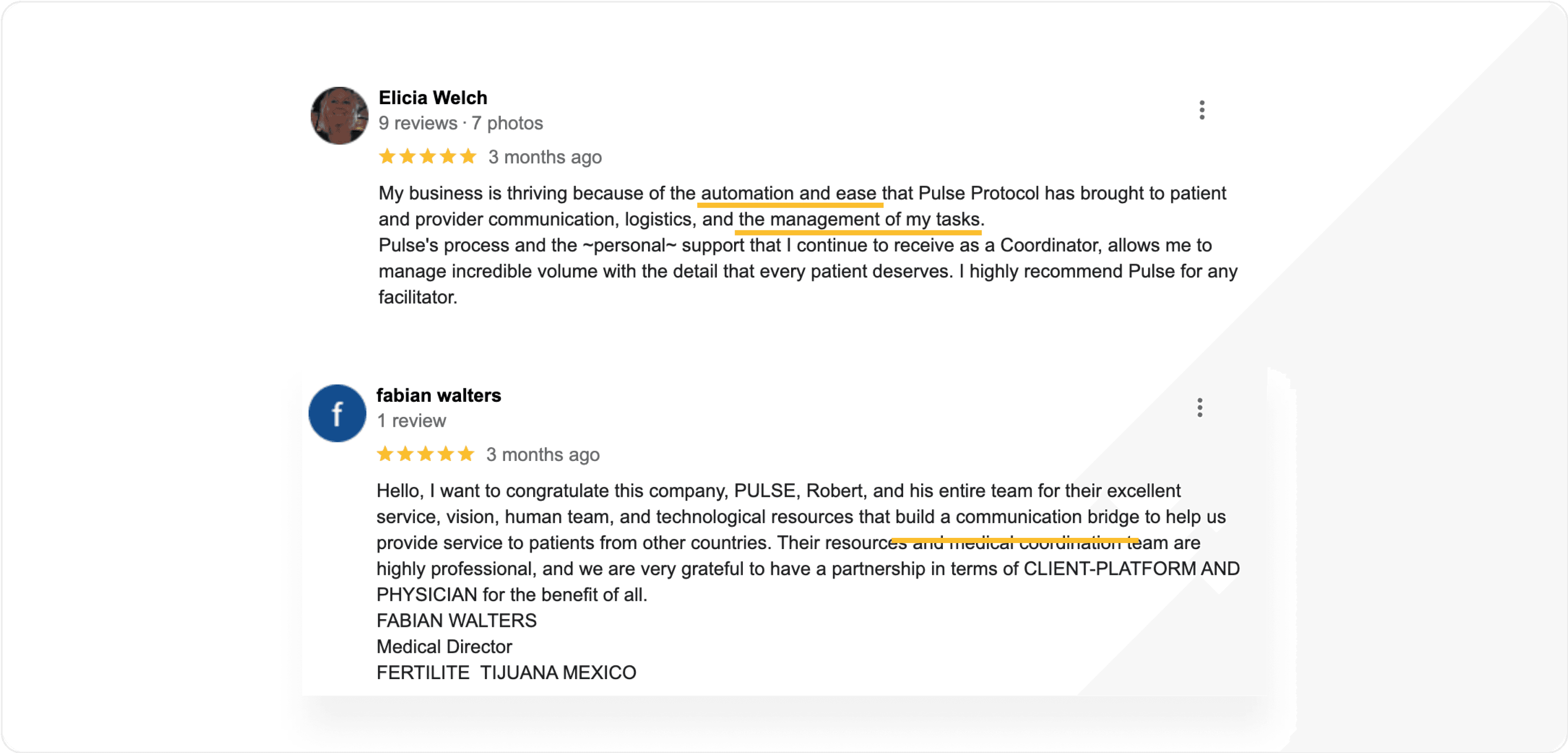
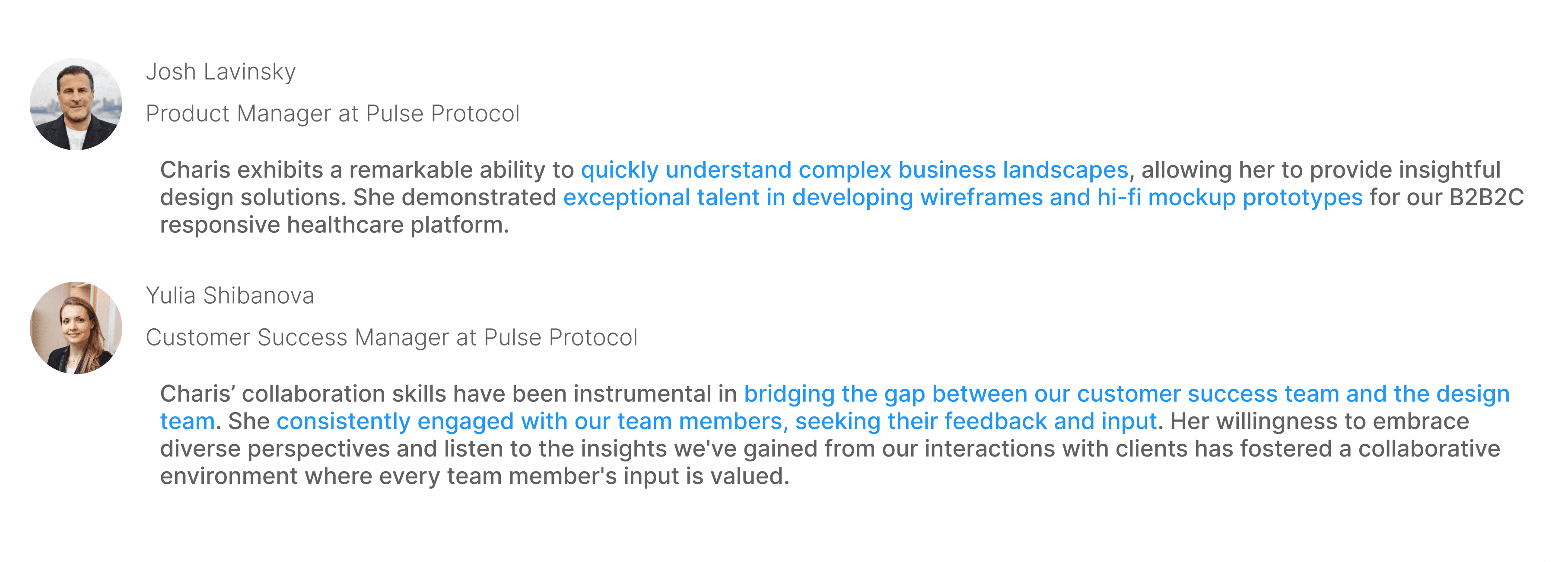
Feedback from my teammates
It's also a wonderful experience for me to align my design with crossfunction teams. I got the following positive feedback from my teams.
Next step & reflection
More iterations are needed to customize the Kanban board for healthcare needs based on user feedback and analytics.
Learning from different types of competitors can provide unexpected insights.
charisliang121@gmail.com · Linkedin · Resume
Website content and deisgn © Charis Liang